Revitalising Web Presence With a New Design System
Visual refresh following a company-wide rebranding exercise, coinciding with a move to a component-based rebuild.
My Role
UI Design / UX Design
The Team
Co-located: Scrum Master / Front End Developer
Remote: Product Owner / Back End Developer x2
HomeServe are a multinational providing insurance cover for a range of home utility emergencies.
Joining the UK based tech hub following a rebrand, I was asked to develop the print style guide into a design system and pattern library for the US website, who wanted something that was distinct from the UK site but felt like part of the same family.
By the way, we just fired our development partner for crazy delays, so your stakeholders hate the UK tech hub already!
Problem
An agency had delivered a rebrand but this didn’t include anything for the digital estate. Joining the UK based tech hub, I was asked to redesign the website for the USA business who wanted something that was distinct from the UK site but felt like part of the same family.
“By the way, we just fired our development partner for crazy delays, so your stakeholders hate the UK tech hub already!”
Solution
A complete redesign of the USA website with a design system and component-based pattern library following atomic design principles.
Product listing pages with redesigned product cards, product detail pages, basket journey and customer account area including slots for product cross/up sells.
Business Impact
Visual consistency throughout the site was greatly improved, presenting a more professional image and building trust with customers.
A component-based build delivers efficiency and scalability with re-usable page modules, reducing development overhead and time-to-market.
The development team were able to swiftly rebrand components to deliver a customer account area for a newly acquired sub-brand, mirroring the parent site and simplifying support requirements.
Users and Audience

Ben
YOUNG PROFESSIONAL
Career focused, working long hours away from home
Goals
- Find a product that covers everything
- Doesn’t want to micro-manage the process if he needs something fixed
“I’m busy and work long hours, I don’t have time to source contractors or do the work myself”

Isaac and Erin
RETIRED COUPLE
Spend most of their time at home or visiting friends and relatives
Goals
- Keep the heating on in winter
- Avoid extortionately high repair costs
- keep premiums low
“Losing heating in Winter is a health risk for us – we need faults fixing fast”

Paul & Maya
YOUNG COUPLE IN FIRST HOME
Renovating their home takes the majority of their spare cash
Goals
- Avoid costly repairs
- Keep premiums low
“This place is a fixer-upper – we need to be prepared for the inevitable”
Process
Atomic Design Principles
The site would use a component-based design, delivered via the Sitecore Content Management System to facilitate multivariate testing. I used the brand guidelines to create the UI following Atomic Design principles to maintain consistency throughout.
Atoms:
These are the smallest building blocks of a site – fonts, colours, an image, html link or other elements such as form labels, an input or a button.

Molecules:
These are groups of atoms. A label, input field and a button together create a search form.

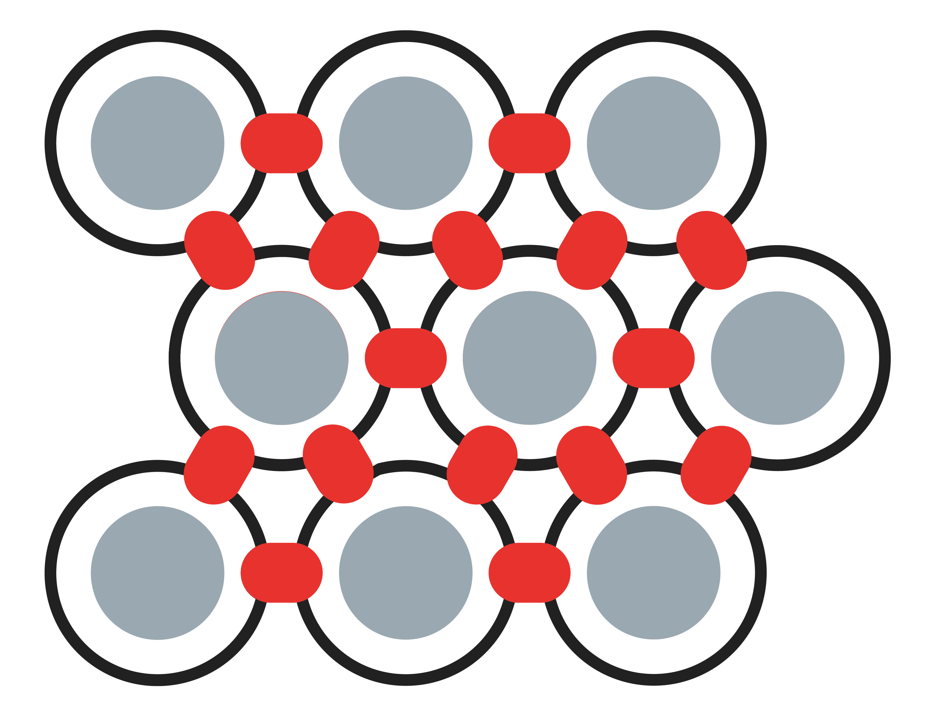
Organisms:
Organisms are groups of molecules joined together to form a relatively complex, distinct section of an interface. A logo, some HTML links and a search form becomes a website header, for example.


Before and After
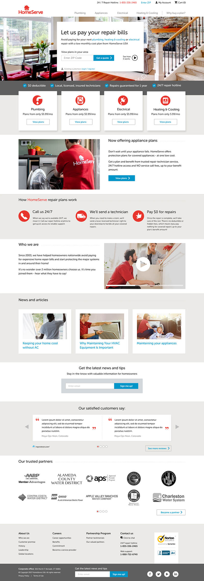
Primary objectives for the homepage were to rationalise the design language and reduce the overall height to keep scrolling to a minimum.
Old Homepage
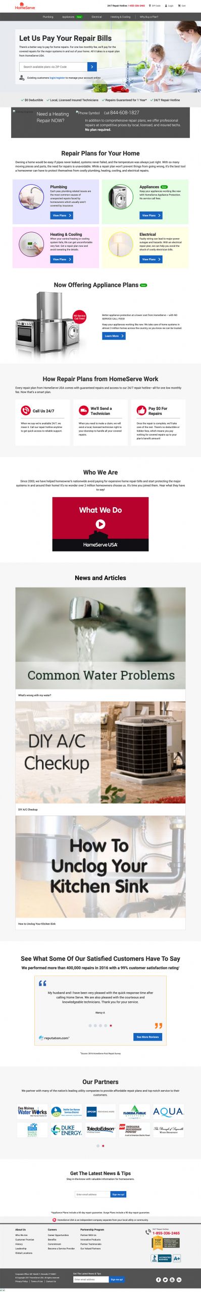
New Homepage
Example Pages

Home

Product Listing
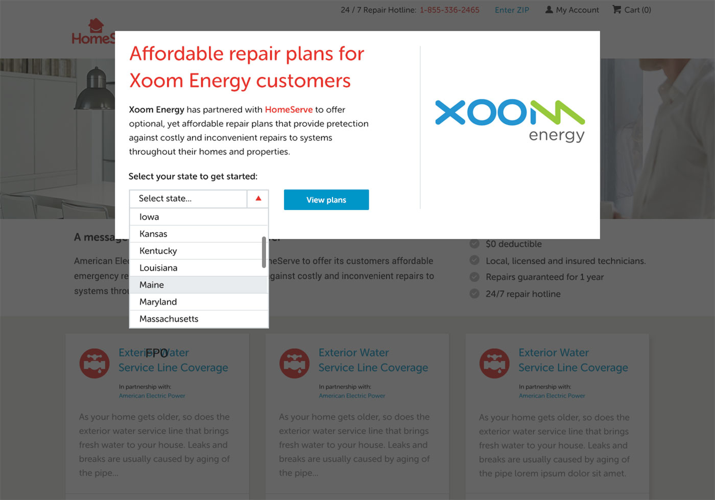
Shortcode Entry Page
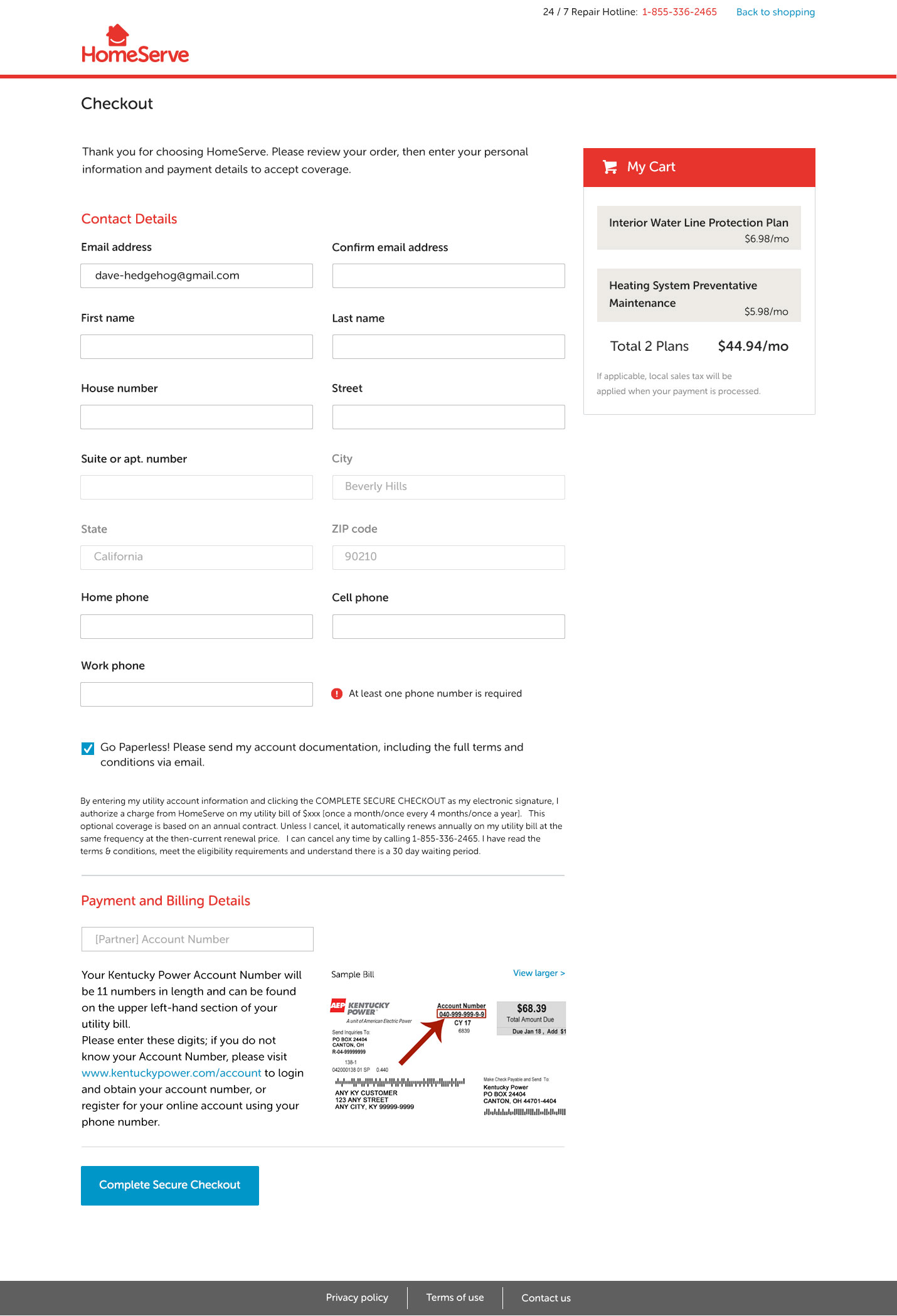
Checkout
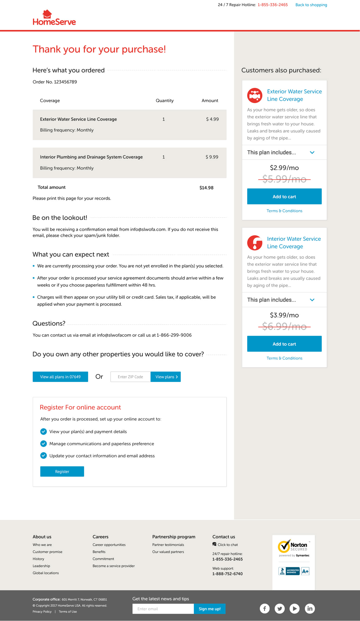
Thank You
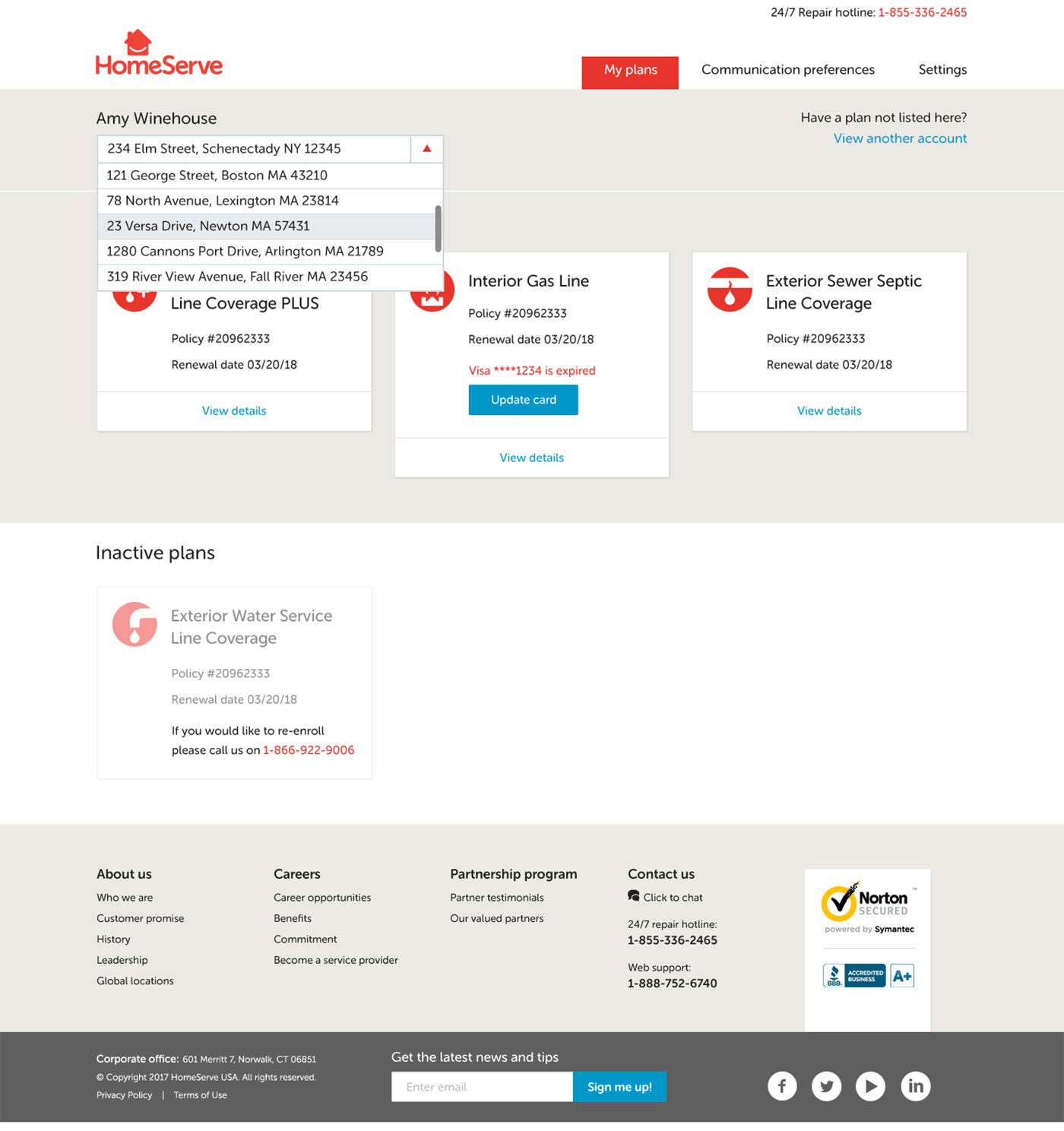
Multiple Addresses
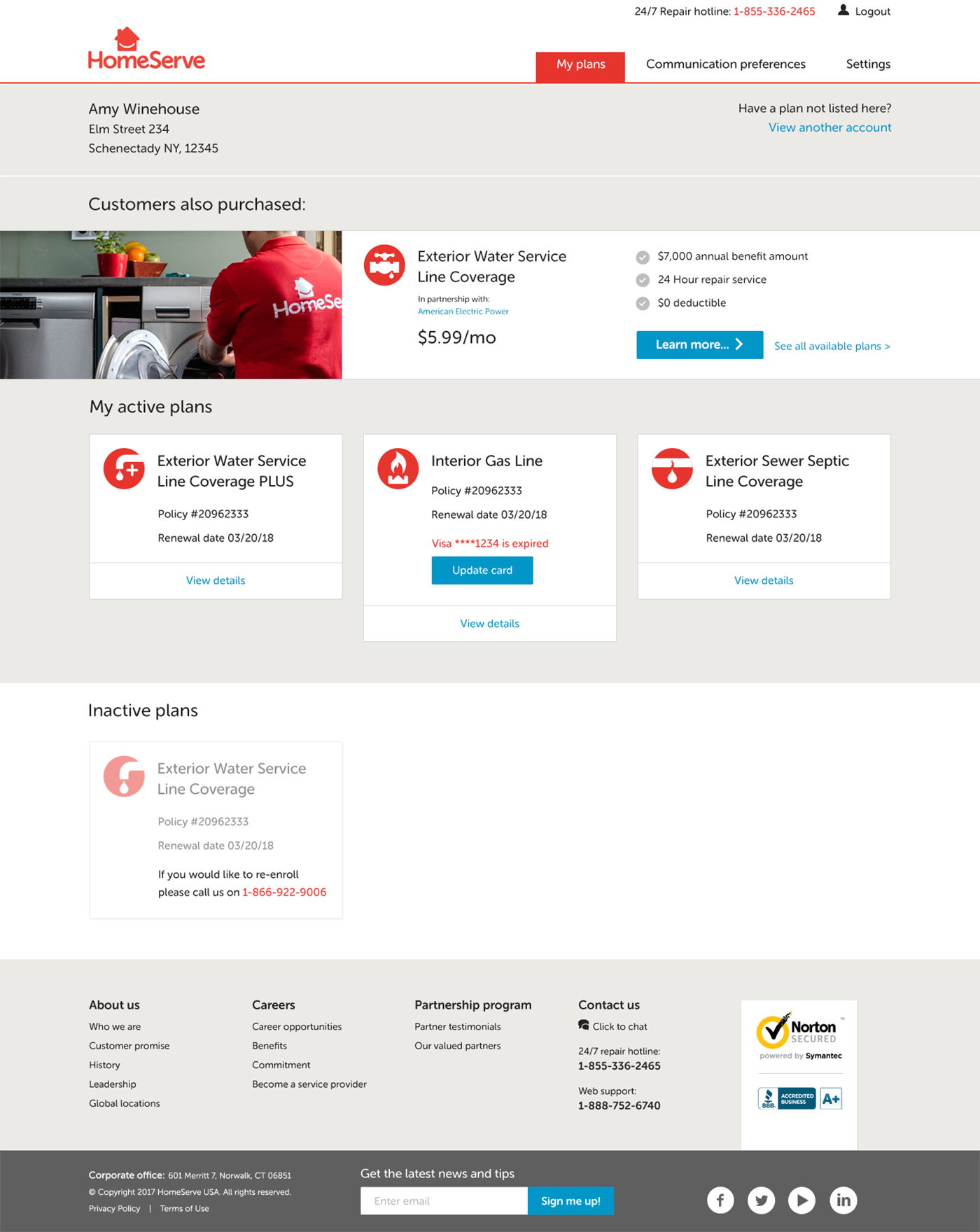
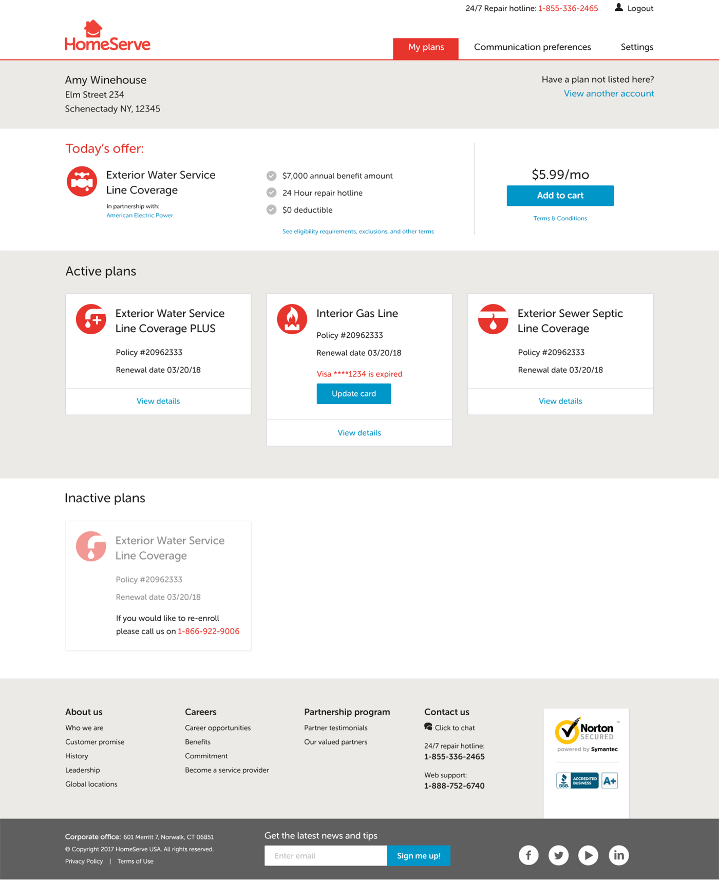
001 – my plans with cross-sell
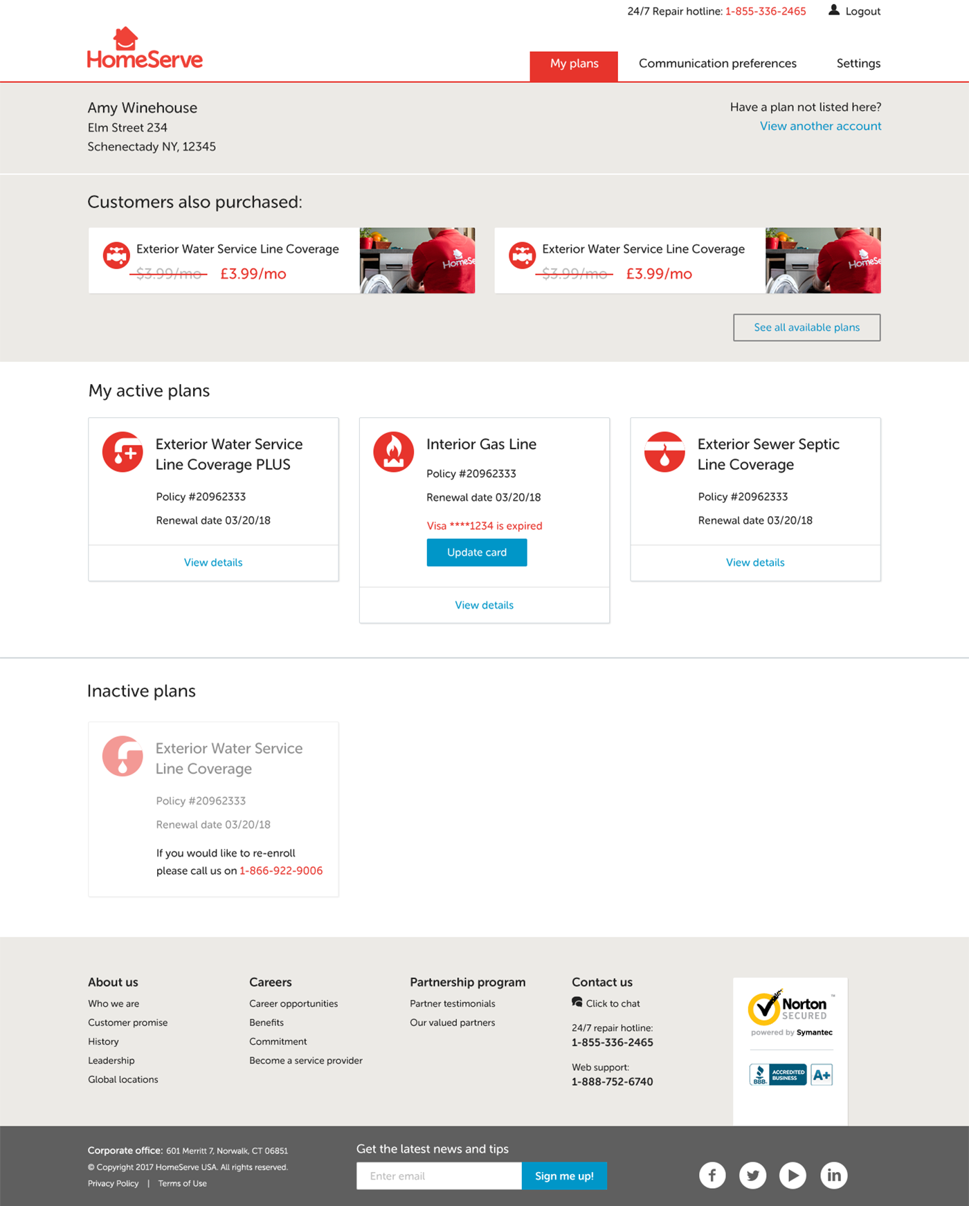
001 – my plans with cross-sell-1
UX Challenge 1
Problem:
Customers are easier to retain when they have more than one service. Drive loyalty by highlighting relevant products in the “My Account” pages.
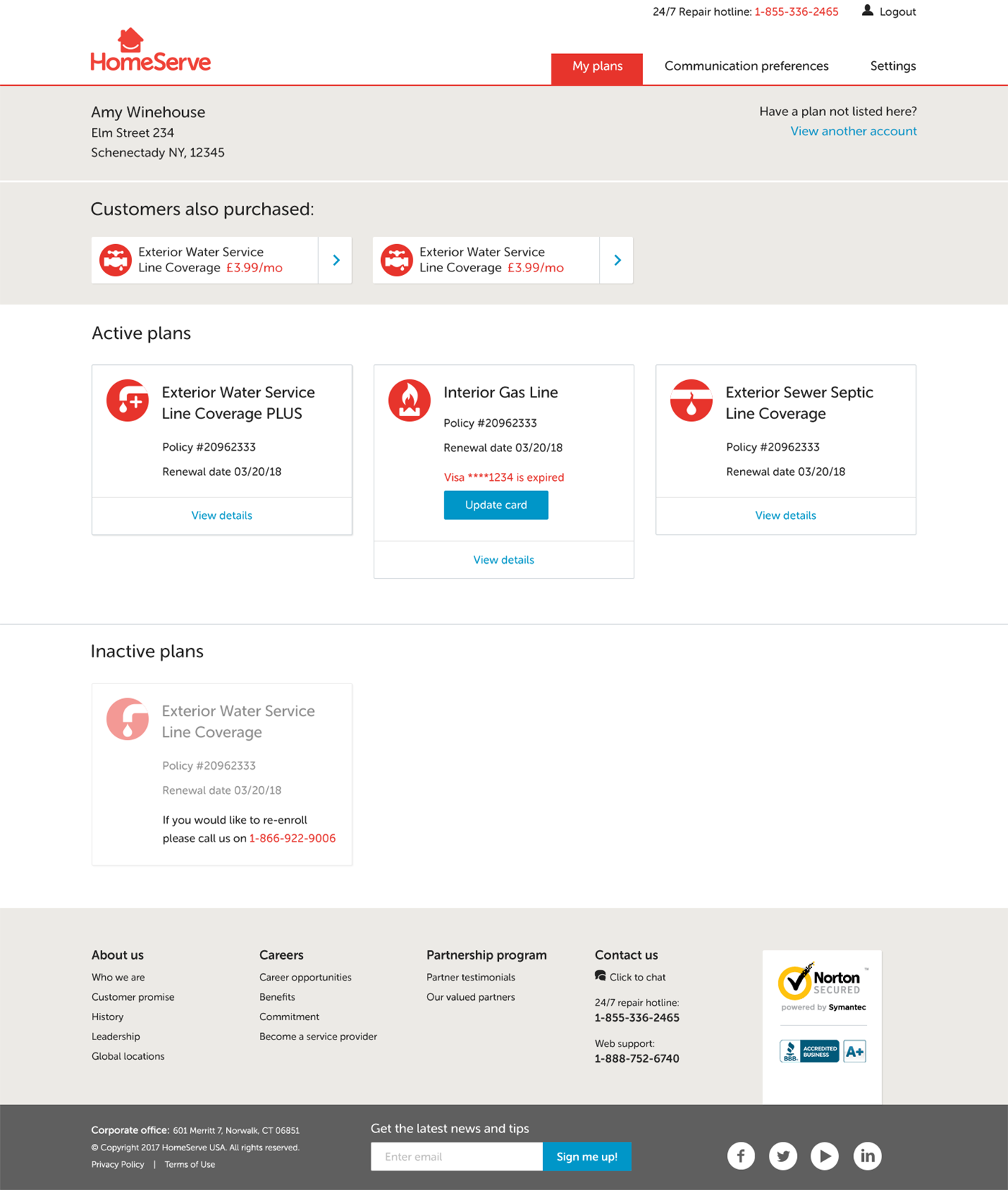
Solution:
I created 4 variants to test different scenarios: Banners with images for extra standout, text only banners, and also versions showing multiple products with and without images.
Room for improvement:
Ideally I would prefer to change only one element per variant during testing to maintain hygiene, otherwise it’s impossible to tell which change affected results.
Single product banner with image:
Single product banner with text only:
Multiple product banners with image:
Multiple product banner with text only:
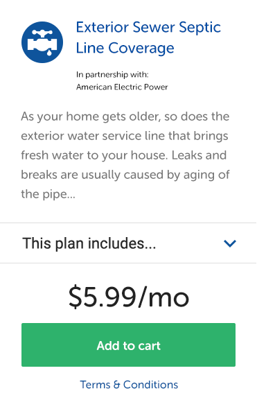
UX Challenge 2
Problem:
The product listing cards were very deep and resulted in a lot of scrolling. Bad on desktop, terrible on mobile.
Solution:
Showing the product description and icon on the same line help reduce the height of the card.
With only one product per type, we didn’t feel it was necessary to list all the features on the card – a pattern more often seen on product comparison pages.
Description copy was made lighter so it didn’t compete for attention with the product title, price or “Add to Cart” button.
Room for improvement:
In hindsight, I’d increase the weight of the blue product title, and scale up the button text.
OPTIONS FOR TEST VARIANTS:
1. Replace the intro paragraph with a few product benefits
2. Remove “this plan includes” to reduce the card height and replace with a “more info” link, leading to the product detail page
3. Add a logo for the partner provider to work as a trust indicator
4. Run variants highlighting a key product benefit to determine which one converts best
5. Re-order the product listing page to highlight seasonal priorities first e.g. air conditioning in summer, heating in winter.
Old product listing card

New product listing card
Outcome and Lessons Learned
Fight the good fight, but understand you’re on the same team
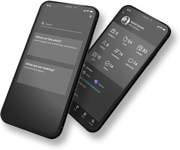
Powering The Circular Economy
Stuffstr
Rapid Interactive Prototyping
Team Machine
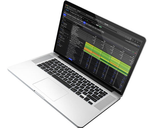
Revitalising a Flagship Platform
London Stock Exchange Group
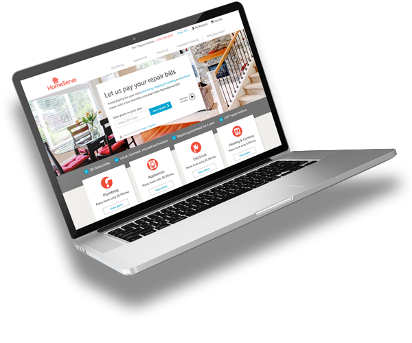
Transforming Web Presence
Homeserve UK
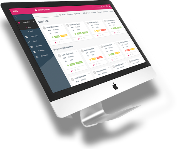
Greenfield SaaS App Design
Redington