App Concept: Uncovering the real network of work
A concept to visualise network graph data
![]()

My Role
Product Design UX+UI / Interactive Prototyping
The Team
Director / Front End Developer / Back End Lead Developer
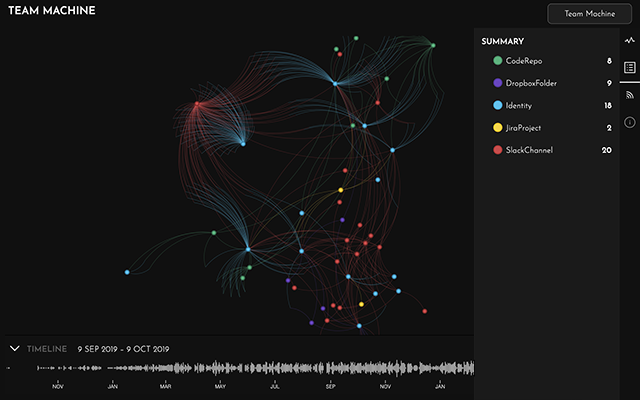
An enterprise-level business intelligence API that pulls data from Slack, Github, Jira, Dropbox, Google Suite etc, to visualise connections and collaborations between colleagues and across projects.
Problem
Network graph visualisations suck for “non-data people”, so I was briefed to create a speculative product to showcase the API in pitch meetings and illustrate how it could be used practically.
“Oh… yeah,
in 5 days,
with no branding or style guides by the way…”
Solution
A fully branded interactive Figma prototype for a product concept to identify in-house project resource, surmised from previous collaborations and network graph data from messaging apps.
I designed the product branding and feature set, plus simplified workflows to connect data sources.
Business Impact
Directors were able to demonstrate the API’s potential without the costly development overhead of a fully engineered MVP.
“Looks great, but I don’t understand it”
Process

Requirements
How much depth should the prototype cover?
Prototype connecting the data sources?
What are the most significant data points to include?
Object Oriented Design
Identify objects, e.g.
– User
– File
– Thread
Identify use cases, e.g.
– What can be done (Title)
– Who does it (Actor)
– How it’s done ( Scenario)
Identify actors, e.g.
– General users
– Notification service
– 3rd party API

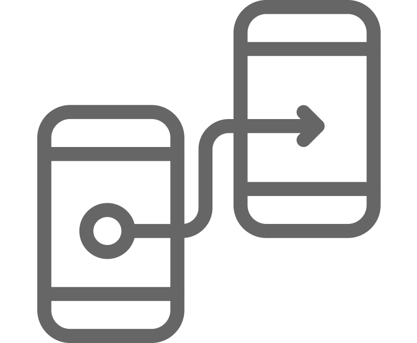
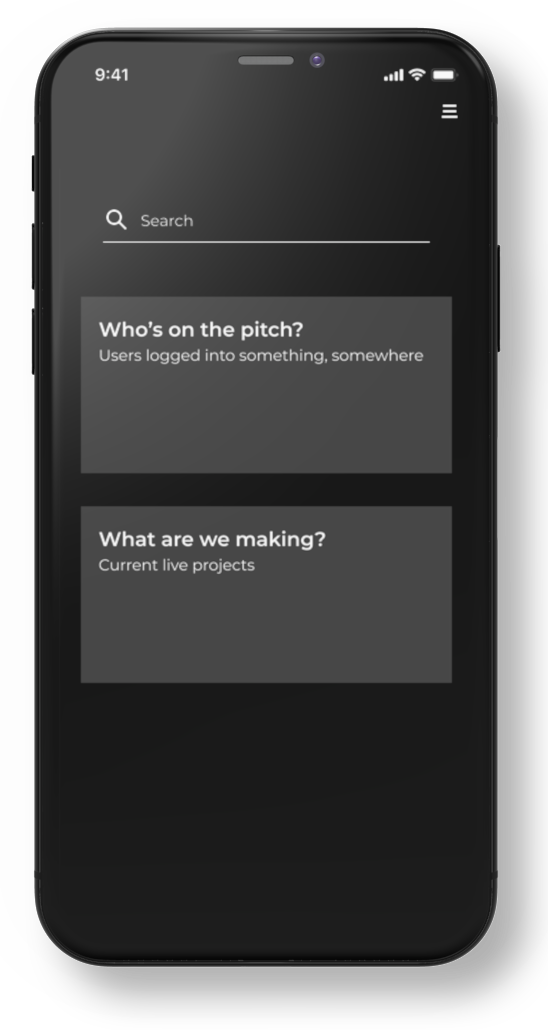
Platform and Interaction Model
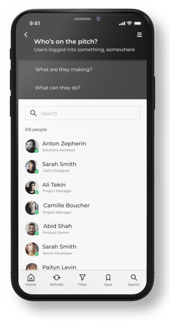
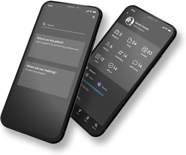
The director wanted to showcase functionality in ad-hoc IRL networking scenarios, so an iPhone app was the best candidate, with objects and data points presented mostly as lists.
Iterative Prototyping
Prototypes created in Figma, tested internally amongst peers (Startup operating in Stealth Mode), iterating on feedback, e.g. an early idea for an AI powered conversational interface proved too complicated in the time allowed.
View this file in Figma
Eating our own dogfood
Given the time constraints, I decided that the most appropriate organisation to model would be one I was familiar with, this would reduce the research overhead finding examples for entities such as job titles, apps used, file types etc.
the aim was to understand the type of questions users might ask when considering the network of an organisation.
- Who is available?
- What can they do?
- What are they working on?
- Who are they working with?
- Who can help me with xxx
- How can I contact [person]
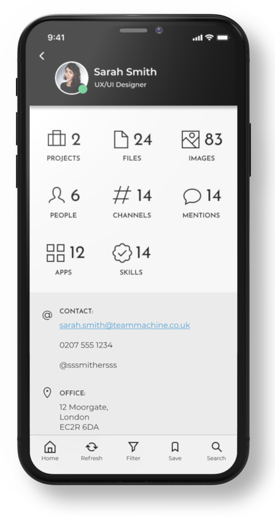
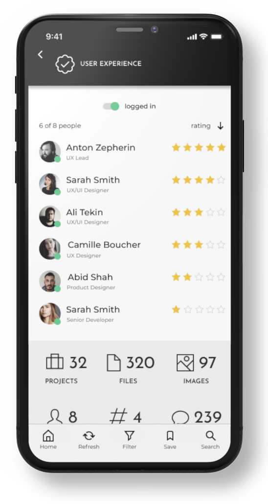
Looking at an individual user, we can see a dashboard showing a summary of the entities they are connected to: projects, files, chat threads, apps they use etc.
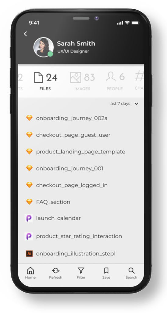
We can drill down into any of these summary headings for a detailed list.
An option to filter or sort the list can help answer questions like “what have they been working on recently”.
NB: the filter “last 7 days” is vague and begs the question “WHAT in the last 7 days?”.
Is that when the file was created, or last modified?
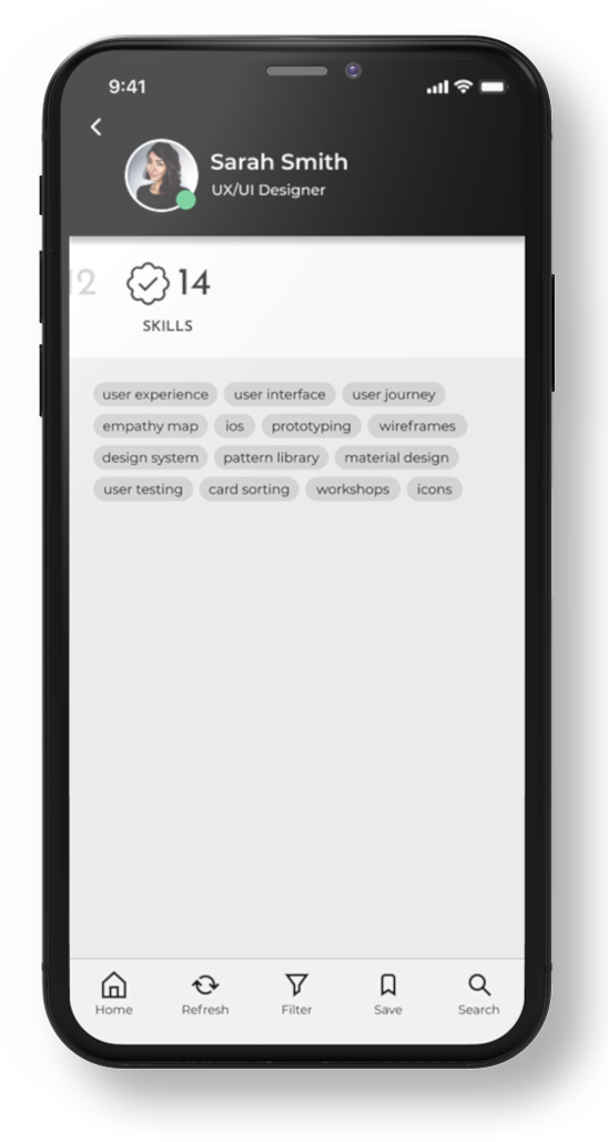
Sarah’s list of skills is presented as a tag cloud. Clicking a skill launches a page of users who also have the same skill, ranked by rating, so we can understand how Sarah compares to other users.
Further development:
We might want to show Sarah’s rating for each skill on her own page.
Clicking a user might show a list of projects where they have used that skill, apps they use, files they created using those apps, other people they worked with.
FAIL!
On reflection, showing the skills in a simple list is a more usable pattern:
- Easier to scan
- Can indicate hierarchy
Outcome and Lessons Learned
Parkisons Law and Force Constraints
Work expands to fill the time made available for it (Parkinson’s Law). Creating a deadline and only allowing 5 days sets a force constraint and encourages a state of flow. In order to maximise my output, I used a Pomodoro timer, working in 1-hour bursts followed by a 10-minute break.
Further development
The concept departs from the Question: Answer paradigm after while in favour of the user navigating by drilling down into the results. This was deliberate as we didn’t have time to build two prototypes but we could have included more hint questions.
I would have loved to spend more time digging into network graph and timeline representations, and also investigating a 3D UI – there was a feeling the team were on the cusp of discovering a new paradigm for expressing the data we had but we never quite got there.
Also, operating in stealth mode, we never really had any meaningful contact with end users, either as part of a research exercise or feedback on design proposals. I’d love to revisit the project with feedback from pitches.
Powering The Circular Economy
Stuffstr
Rapid Interactive Prototyping
Team Machine
Revitalising a Flagship Platform
London Stock Exchange

Transforming Web Presence
Homeserve UK
Greenfield SaaS App Design
Redington