Investment Research Application
A domain-specific research, data and document management app for investment professionals
My Role
UI Design / UX Design
The Team
Co-located: Scrum Master / Front End Developer
Remote: Product Owner / Back End Developer x2
Redington are a boutique investment consultancy, advising pension trustees and providing wealth management.
ADA } RESEARCH is a domain-specific research, data and document management tool for investment professionals.
Problem
Developers had built a proof-of-concept with a working model of the relationship between funds, managers, investment houses, meeting notes etc. but the visual design and overall user experience had not been addressed.
“It works…just! But it doesn’t look professional and we need to make sure it performs for our users“
Solution
Side-by-side interviews with end users to determine pain points, refine task flows and ensure fitness for purpose.
As a design-team-of-one, I used Google’s Material Design System to accelerate the UI design process, reduce the need for documentation and freeing time to focus on user experience.
Business Impact
User interviews uncovered unique functional requirements that would give the product competitive advantage.
Leveraging Google Material Design produced a consistent, market-ready UI that we could easily white-label.
Users & Audience

David
JUNIOR CONSULTANT
Performs data entry. Frequent user, working in long sessions.
Goals
- Populate the system quickly and accurately, copying from systems and paper documents
- Develop the taxonomy, establishing the links between entities
“I have a lot of data to enter, the quicker the better”

Lauren
SENIOR CONSULTANT
Viewing and recording sentiments. Frequent user, working in short bursts
Goals
- Navigate the hierarchy quickly
- Understand the relationship between entities
- Review and update entity status
- View and add relevant documents
- Know when entities have been updated
- Understand the rationale for an entity’s status or any changes made
- Make decisions and recommendations based on comprehensive information
“I need to be confident my recommendations are based on the most up-to-date information and be able to explain any changes to my clients”

Bridget
PERSONAL ASSISTANT
Pulling reports for C-Suite. Light user, working in short bursts
Goals
- Quickly find a specific entity
- Export report(s)
- Respond to Director requests in a timely manner
“I don’t have time to compile reports from all over the place, I just want to click and go”

Alkesh
C-SUITE
Viewing reports. Light user.
Goals
- Quickly understand an entity’s current status
- Understand the rationale for an entity’s status or any changes made
- Understand the relationship between entities
- View relevant documents
- Make decisions and recommendations based on comprehensive information
“Just give me the summary, with an option to drill down if I need to”
Process

Understand Wealth Management Domain
Plenty of acronyms and industry specific language to get my head around, plus understand the fund review process
Research Adjacent Products
I defined three key areas of functionality: Document Storage, Collaboration,
Recording Sentiment.
Alongside compliance management software, I also looked at document storage systems with collaboration features:
Jira/Confluence, Zendesk, Dropbox Paper, Google Docs, Sharepoint
and services with rating systems: Amazon, Glassdoor, trustpilot

Field Studies
Side-by-side, contextual interviews with end users and subject matter experts to deepen understanding, flesh out user journeys, identify pain points and reveal feature opportunities.
Feature Prioritisation
Collaborative sessions with the Product Owner, Development Team, representative Subject matter Experts and other stakeholders. Prioritising features to build an MVP that would deliver maximum value and encourage further client investment
Wireframes + Prototyping
Sketch was the weapon of choice, using Google Material Design System for the UI. Initially I used both Sketch and Atomic.io for interactions (now defunct) before moving to Principle.
I built super-low fidelity, clickable wireframes using Sketch to sense-check and finesse user journeys, before building more detailed versions for testing.
Refining the UI
Before
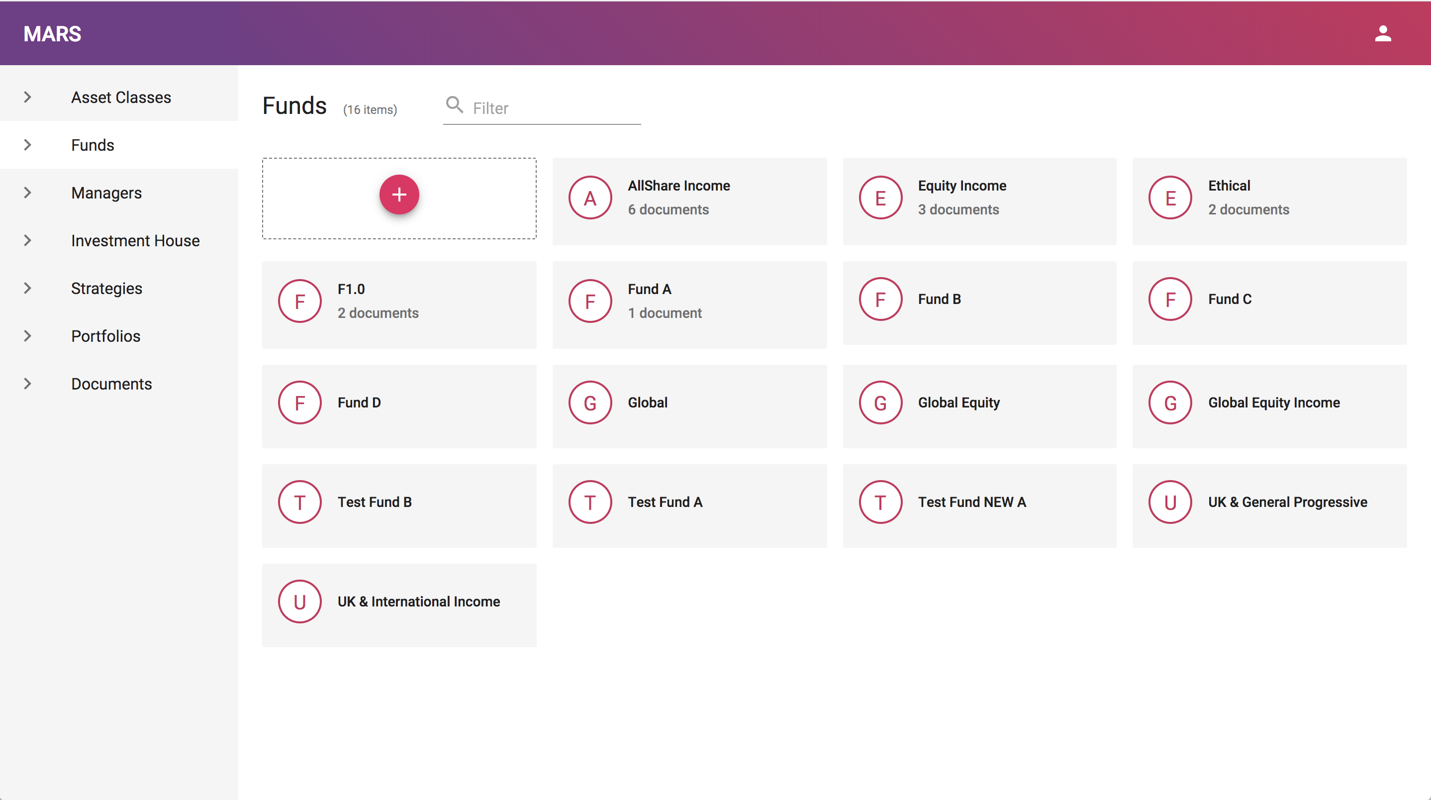
The original UI built by the development team didn’t reflect Redington’s recent rebrand.
There is no indication of the status of each fund.
There was also an opportunity to improve the UX copy – for example, the search input field was incorrectly labelled as “filter”.
After
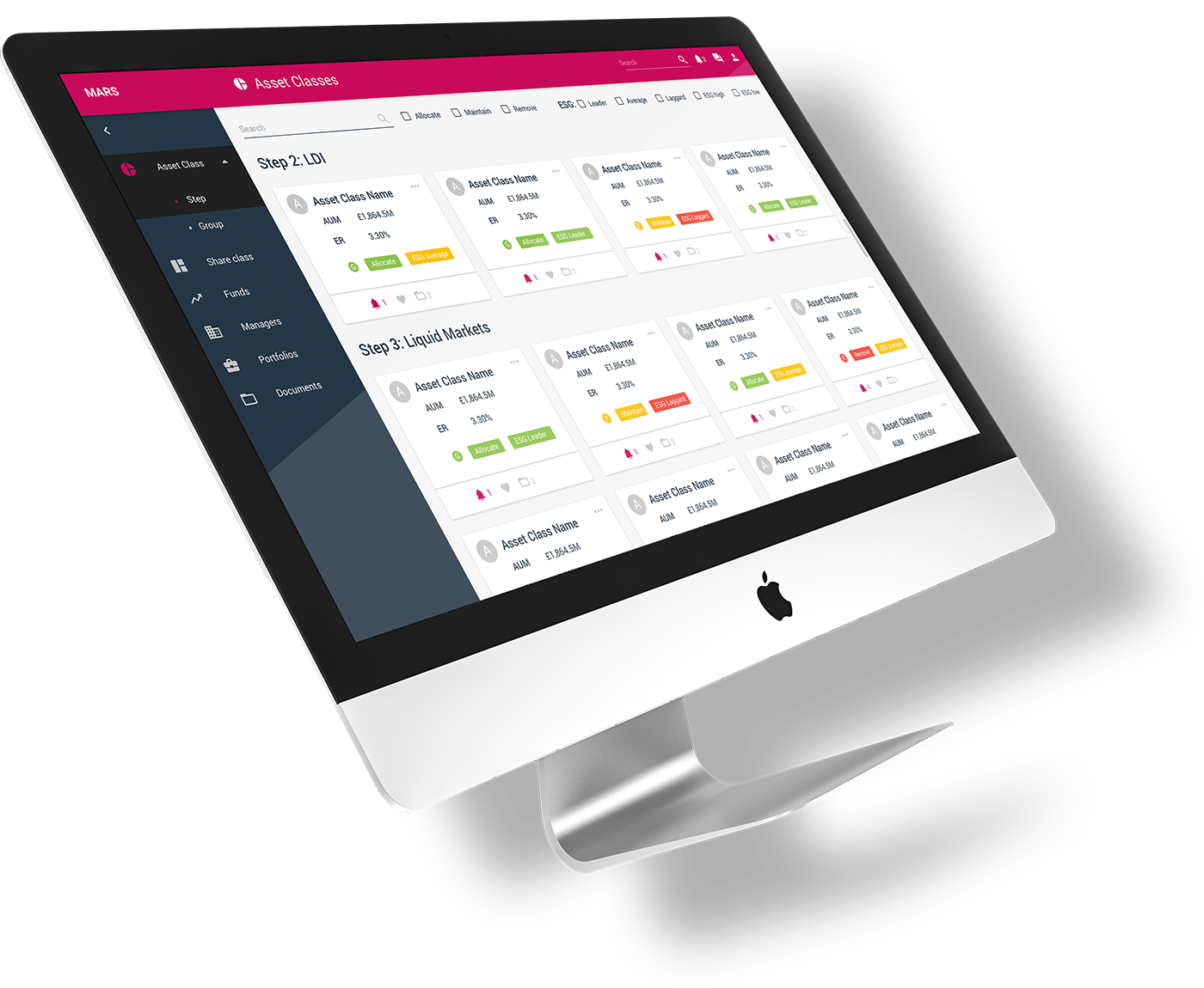
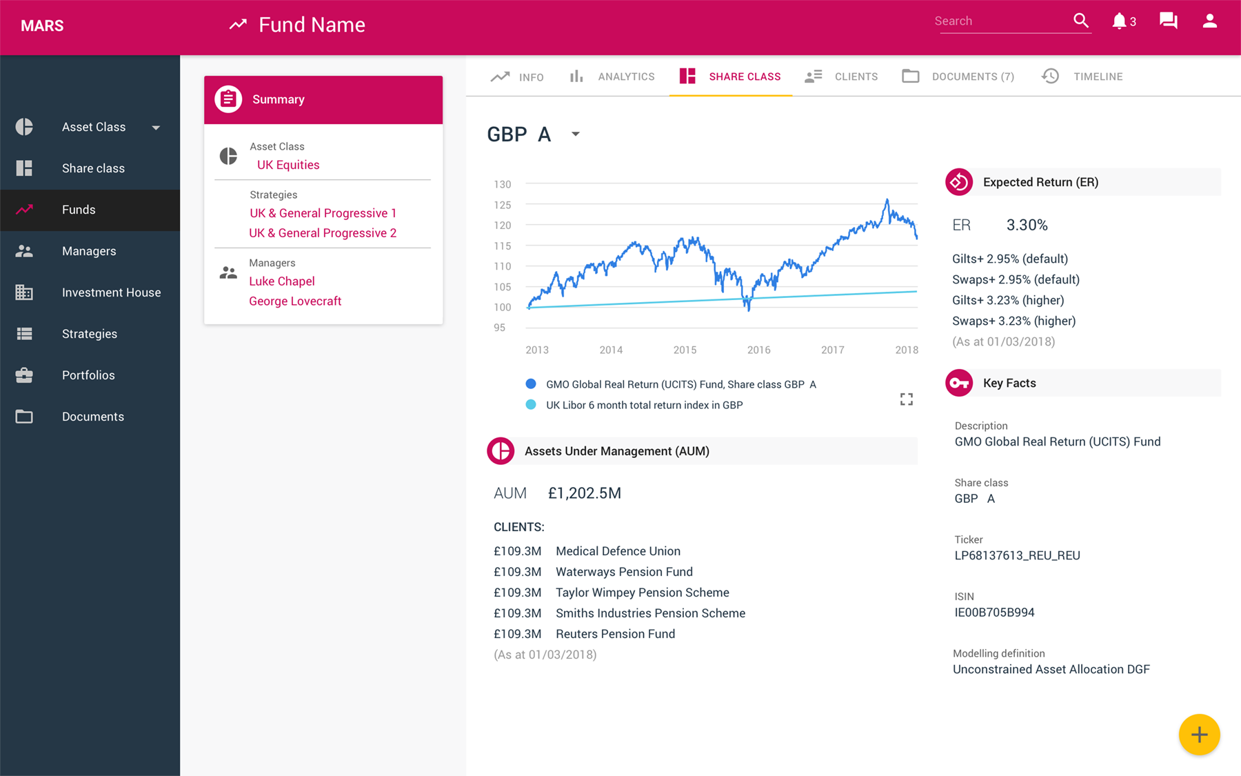
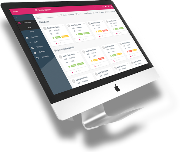
Material Design system applied, using brand colours from the Redington website.
Fund cards now include more info at a glance, reducing clicks, with an opportunity to drill down further. The list can now be filtered.
Closed funds are clearly indicated.
Funds can be added or edited via the floating action button, bottom left. This is a constant UI element revealing context-specific functions per page.
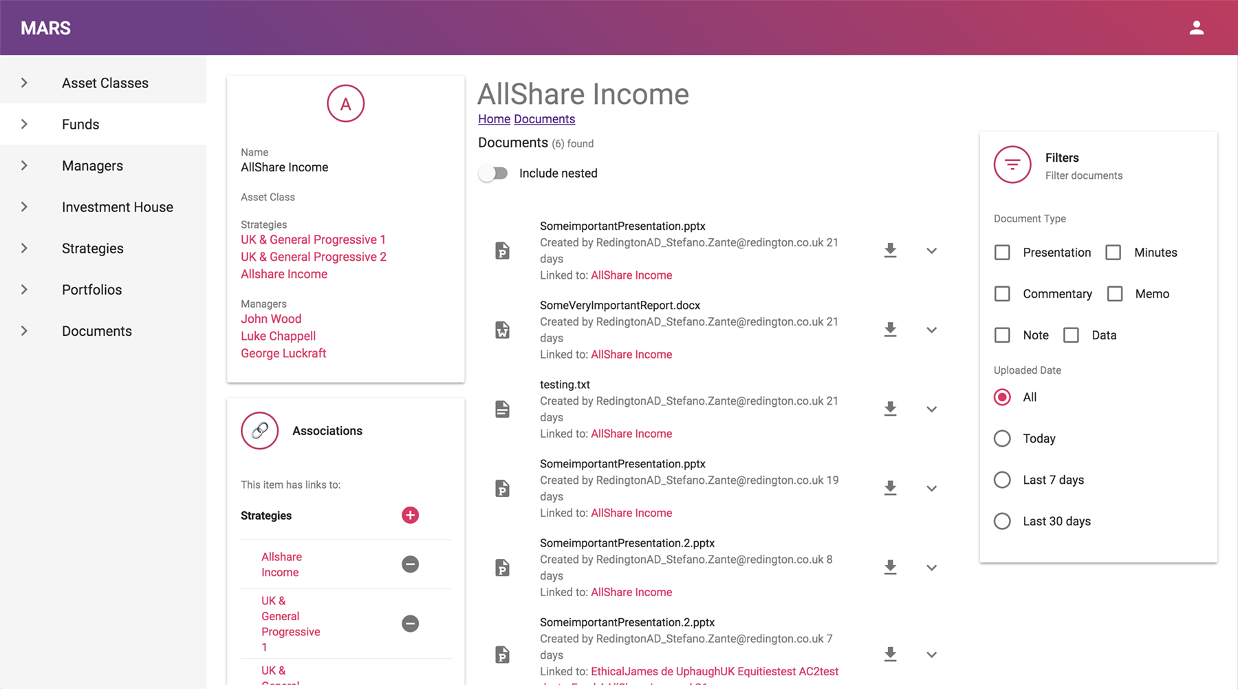
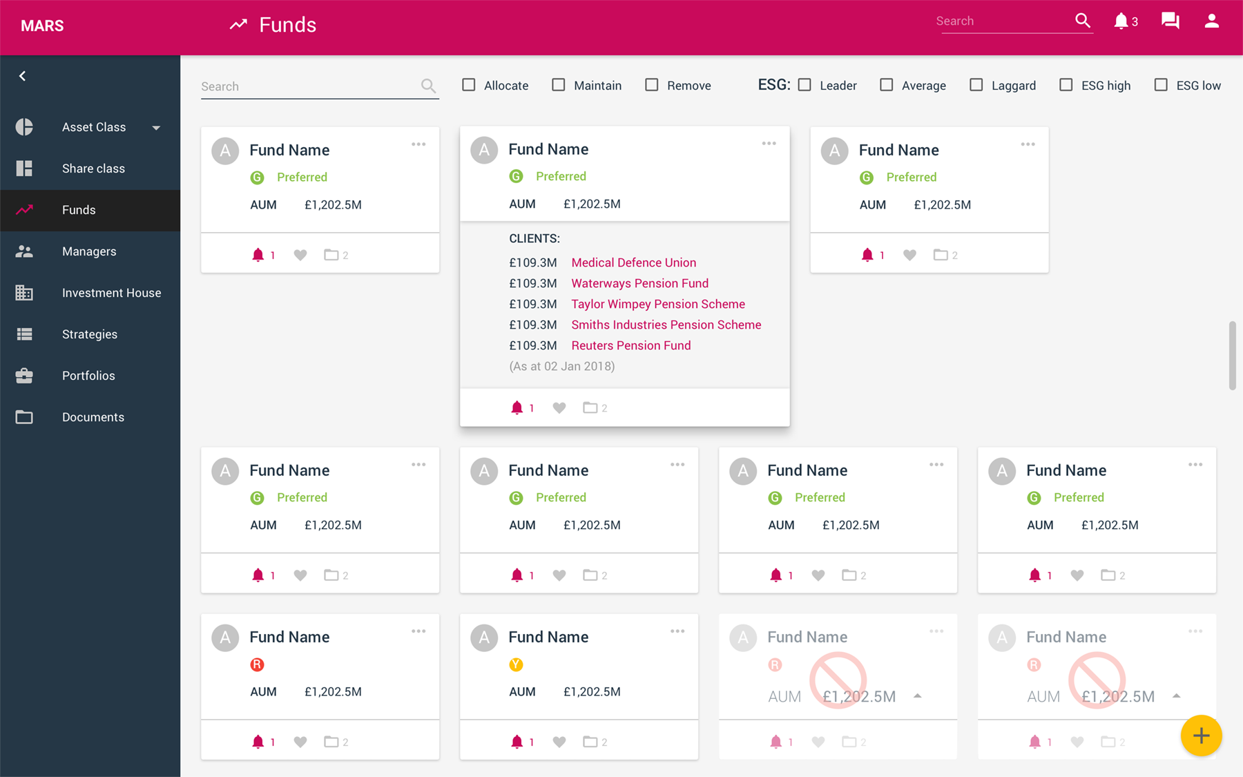
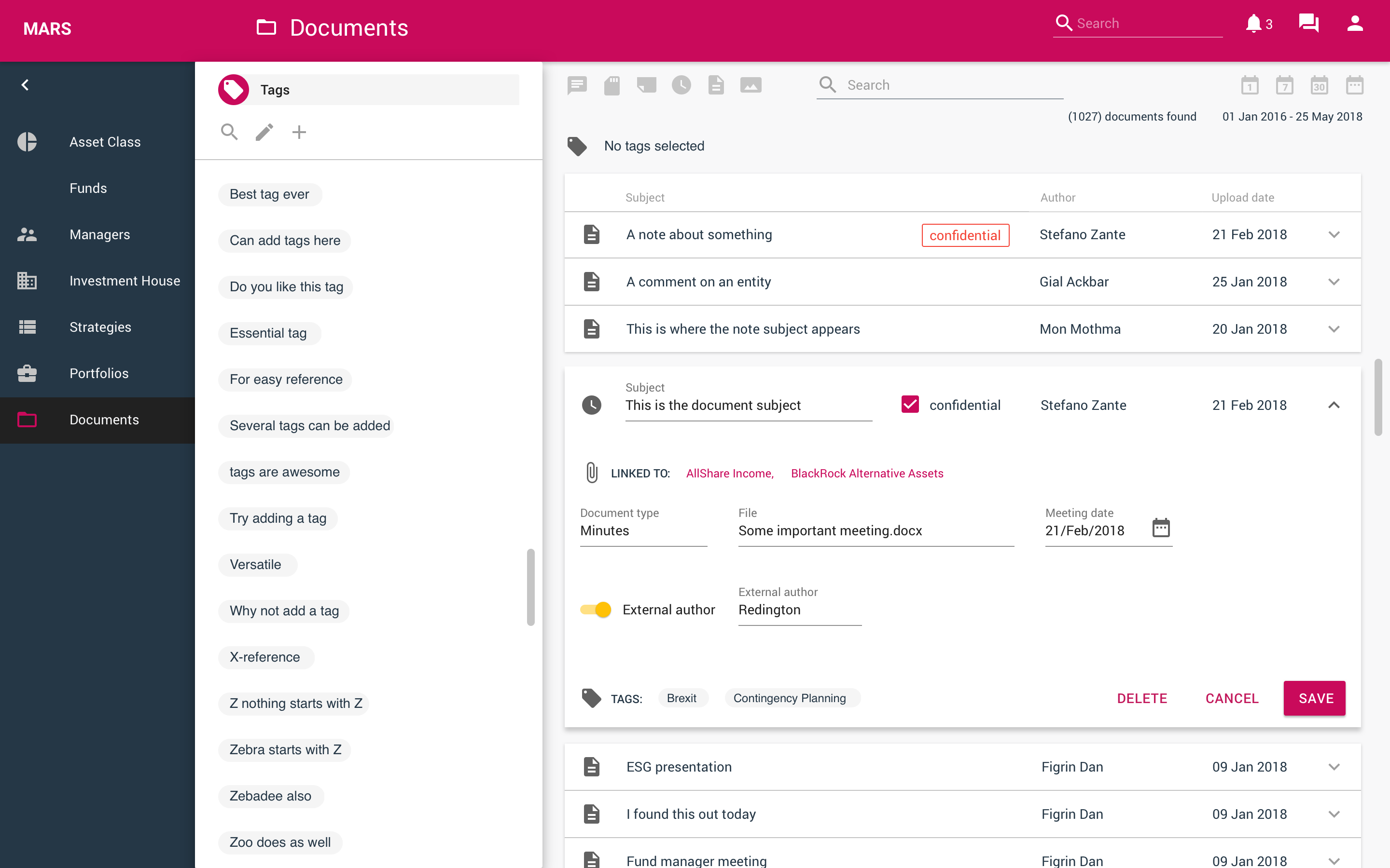
The fund information page lacked any hierarchy and also included a list of documents, with the document filters taking up a lot of screen real estate.
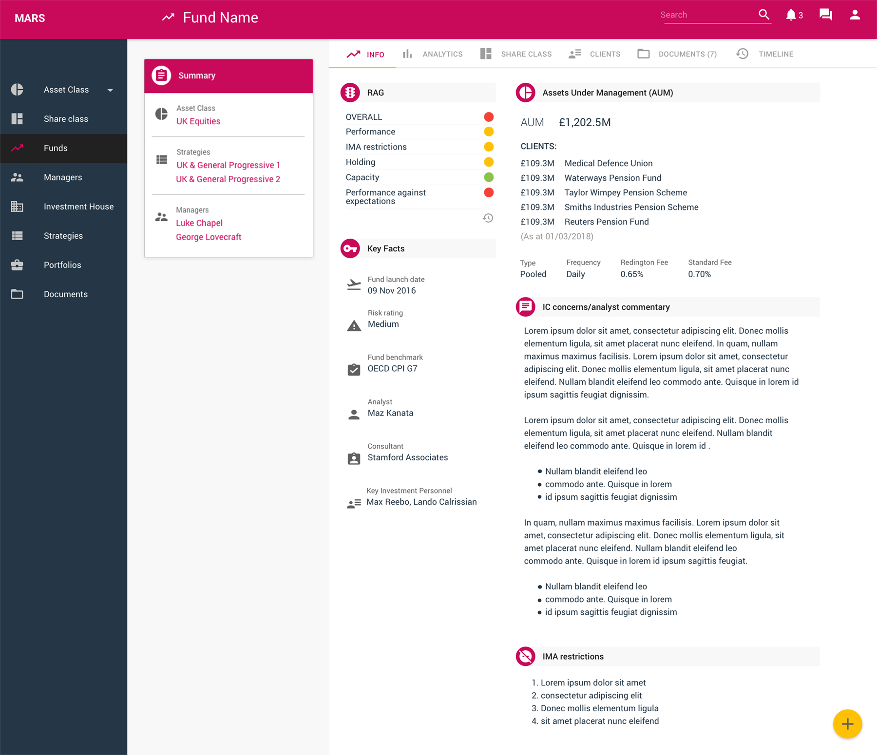
Documents are still important in supporting the analyst’s commentary, but these are secondary to financial values and key facts, so they are now found on their own tab.
Tabs have also been included to group other related content such as fund analytics, share class information, invested clients and a timeline to show a history of activity.
As a UX team of one, I didn’t have the luxury of time to create a bespoke design system. Specifying Google’s Material Design was a quick-win that reduced development time, helped build the client’s confidence in our capabilities and also allowed me to quickly illustrate how branding could be applied when the app was eventually white-labelled.
Outcome and Lessons Learned
When time and budget are tight, pragmatism wins the day
Coming from a graphic design background I would have loved to spend time creating a unique design system for a suite of products. However, specifying an off-the-shelf solution delivered a very big, quick win in terms of client reception, and showing the productivity gains this would deliver for the development team built credibility which allowed us to stand our ground on some of the more difficult issues.
Early wins pay dividends
Early wins with functionality and UI styling and positive client feedback led Redington to expand the team and broaden the remit, refactoring several in-house tools to create a suite of SaaS products.
Make sure the right people are in the room
For transparency, workshops initially included stakeholders from each user group, but it was hard to stay on topic and major stakeholders often dominated the discussion. We moved to holding separate sessions for the end users, presenting findings in prioritisation workshops for the senior team.
It’s boring, but plan in time to stay on top of admin
Scope and priority changes lead to a gap in expectations and work delivered at the end of the first quarter. We reconciled this using detailed notes from our prioritisation workshops. We also noted rationale for design decisions in the component library, saving time when we returned to parked user stories.
Powering The Circular Economy
Stuffstr
Rapid Interactive Prototyping
Team Machine
Revitalising a Flagship Platform
London Stock Exchange

Transforming Web Presence
Homeserve UK
Greenfield SaaS App Design
Redington