Powering the Circular Economy
Interactive prototype contributes to a new client win and business investment.
![]()

My Role
Product Design + Strategy / Research / UI Design / UX Design / Email Design / Content Design / Interactive Prototyping
The Team
Chief Product Officer / Business Analyst / Front End Developer
Back End Developer / E-commerce consultant
Stuffstr is a recommerce start-up that integrates with a brand’s e-commerce site. Customers sell unused garments back to the retailer, enjoy fashion and sports in a responsible, sustainable way, and maximise the lifetime value of everything they buy.
Problem
A pilot with our funding partner had significantly underperformed.
I was tasked to propose improvements to increase engagement ahead of a new client pitch.
Solution
Redesigned onboarding and physical collateral.
Identified discovery touchpoints in the prospect’s e-commerce app, leveraging their UI and UX patterns to prototype a seamless integration of our service.
Devised an email follow-up sequence to encourage service completions.
Business Impact
A new client win and business investment.

Users and Audience

Nitesh
KEEN RUNNER
Runs every day, whatever the weather
Goals
- Recoup the cost of replacing worn-out gear
“I get through a LOT of running gear, but I hate just throwing it away”

Sarah
ENVIRONMENTALIST
Frugal, value conscious, likes to look good but worries about her carbon footprint
Goals
- Extend the life of unused clothes
- Reduce environmental impact
- Maybe make a little bit of extra money
“I want my old stuff put to good use – I’d rather someone else had the benefit of them”

Zayne
FASHION LOVER
High disposable income, regularly updates wardrobe
Goals
- Stay on trend
- Make the most of money spent
“I’m a sucker for the latest trainers but I spend way too much, too often”
Process

Review existing communications
The trial was led by editorial in the partner’s app, plus a series of emails for app users. I also looked at the design of the Stuffstr return bag and its instructions.
Research competitors
I looked at other used clothing services, marketplaces, and traditional e-commerce.
Depop, Vinted, Bagista, Vestiare, Trove,
Asos Marketplace, Ebay, Gumtree, JD Sports, Zara, BooHoo, Religion, Nike

Understand "Green" Domain
I reviewed businesses with a strong environmental focus, non-profits and other cause-related concerns for learnings around branding and messaging, e.g.
Treehugger, Innocent Drinks, Patagonia, Veja, Nudie Jeans, RSPCA, Just Giving, Grist, Friends of the Earth

Identify discovery touchpoints
I reviewed the partner’s e-commerce app to determine potential opportunities to discover the Stuffstr trade-in proposition.
Key takeaways
- Discovery was limited to a single editorial article in our partner’s e-commerce app
- Due to concerns about our fulfillment capacity, further touchpoints had not been explored
- Tone should not be too preachy, lecturing or shocking
- Authenticity is valued
- Design for users focused on environmental concerns
- Other users may be more motivated by savings
- To build trust, integrate the Stuffstr proposition within the partner app, rather than an external site
- Execution of the Stuffstr returns bag and instructions was rudimentary, undermining trust in our service and negatively impacting the partner’s brand
- Untapped opportunity to schedule multiple follow-up emails to encourage engagement and increase Stuffstr bag returns
Potential Discovery Touchpoint Examples in-app
Homepage

Menu

Product Filter

Menu

Product Detail

Product Detail – Description

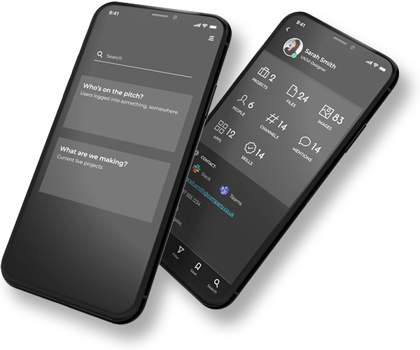
Prototyping app integration
Prototype
I built an interactive prototype of the partner’s app in Figma, to show how a user’s trade-in journey would integrate.
Design patterns used modified versions of existing components from the product purchase journey, for familiarity and a coherent product experience.

Outcome and Takeaways
A new client win
For an integrated service, it’s critical to show your solution in context. High fidelity, branded interactive prototypes show how a service fits seamlessly into an existing website or app, taking on styling and UX cues from the host product. The pitch didn’t just win the client, they invested too.
Imposter syndrome be damned
Unlike agencies where roles and processes are clearly defined, in a start-up, you’ll often wear multiple hats. Uncertainty and imposter syndrome is always around the corner, especially if you’re stepping outside your comfort zone. Do your research when you’re building a new service, sure, but don’t waste time second-guessing yourself. That’s what testing is for. It’s OK to be wrong sometimes. You need to fail fast and iterate.
UX doesn’t start or end on-screen
A user’s experience isn’t confined to the bubble around the product you’re building. Consider ALL the possible touchpoints, sometimes the problem might be happening off-screen.
Be consistent
Maintain visual consistency across all touchpoints in a user’s journey, especially when the journey crosses both analog and digital domains. Be mindful that physical collateral often has a longer shelf-life than digital.
You’ll have an easier time if you make life easy for others
Although not the case in this example, working with third parties where you don’t have control over how your product is presented can be challenging. The bigger the partner, the longer it will take for decisions to get through their hierarchy. Push to work directly with the most senior decision-makers possible. Respect their time and make it easy for them to decide: present clearly articulated and rationalised solutions, not problems.
Powering The Circular Economy
Stuffstr
Rapid Interactive Prototyping
Team Machine

Revitalising a Flagship Platform
London Stock Exchange

Transforming Web Presence
Homeserve UK
Greenfield SaaS App Design
Redington